Instantpay
Designed a unified insurance experience across web and mobile — making buying and selling policies easier, faster, and accessible
Role:
UI/UX Designer
Platform:
Web/App
Status
Live
Duration:
3 Months
Background
Why Insurance?
The insurance module was introduced as a strategic requirement from stakeholders to broaden Instantpay's offerings to grow the business. This module was designed to create another way to earn revenue by allowing retailers to sell insurance within the existing platform.
Kicking off the journey
The Insurance module started with a stakeholder brief to introduce a new vertical for retailers to learn, certify, and sell insurance. The brief was translated into a functional product through well-defined flows, wireframes, and final UI design. Close collaboration with stakeholders and vendors helped simplify complex journeys, ensure compliance, and deliver a scalable, intuitive experience tailored for Instantpay retailers.
Context
Understanding the users
Instantpay Retailers (Certified POSP Agents) - The primary user of this module is the existing Instantpay retailer — most often a small business owner, a local merchant, or a micro-entrepreneur who already uses the platform to provide financial services such as bill payments, connected banking, and working capital loans.
To unlock and use the insurance module, these retailers must first complete the POSP (Point of Sales Person) certification. This makes the flow a progressive journey:
Retailer → Insurance Trainee → Certified POSP (Insurance Seller)
“With no existing patterns to rely on, building the insurance module from scratch brought unique challenges that demanded clarity and precision throughout the process.
Building the insurance module from scratch came with unique challenges—secondary research revealed lengthy forms and too many steps, making clarity and simplification essential from the start, beginning with competitor research.
Secondary Research
Understanding the Raw Structure
Before moving into UX patterns or competitor research, the initial step involved analyzing the available insurance flows, forms, and documentation. This revealed which elements were fixed, which areas offered room for improvement, and where potential UX challenges could surface.
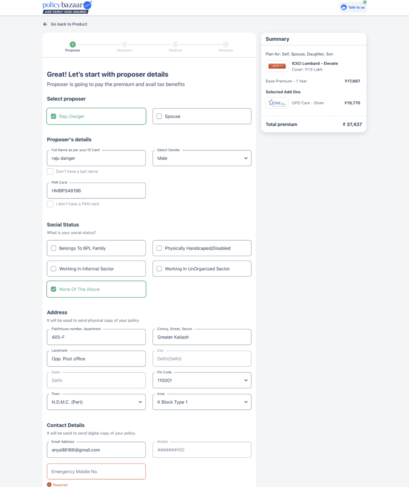
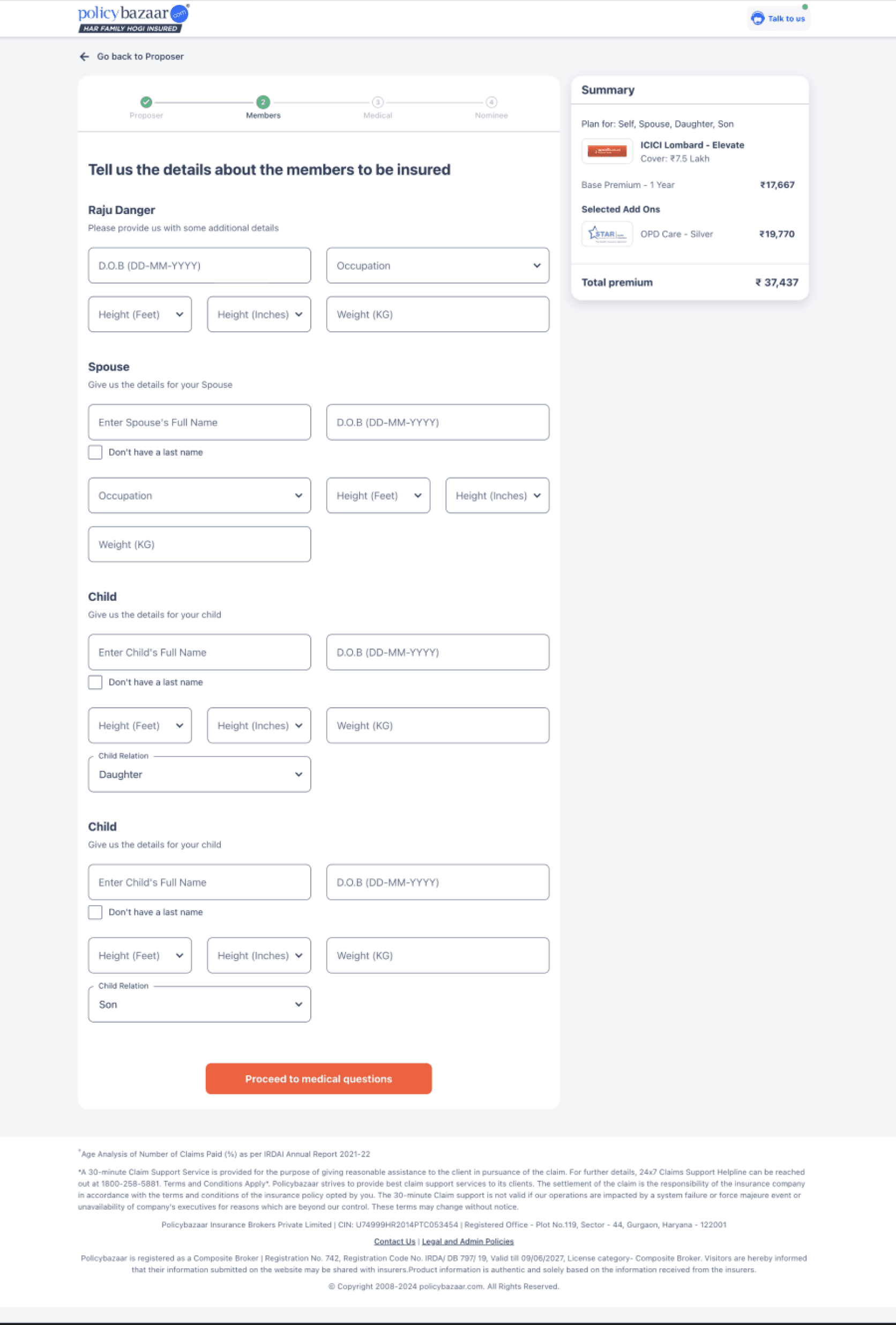
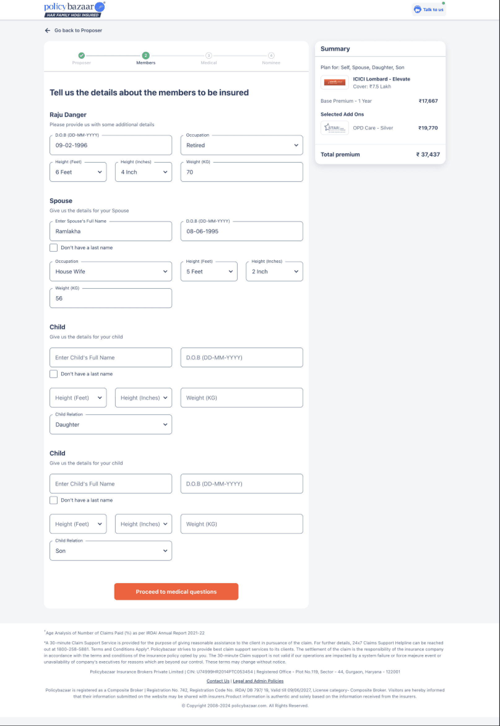
Policy Bazaar
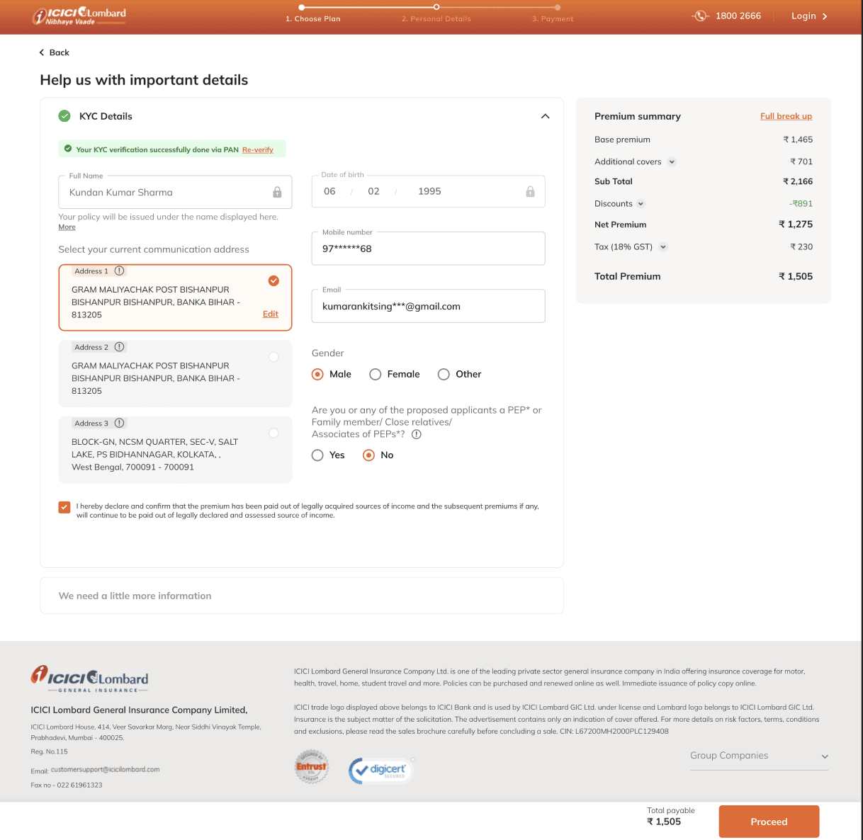
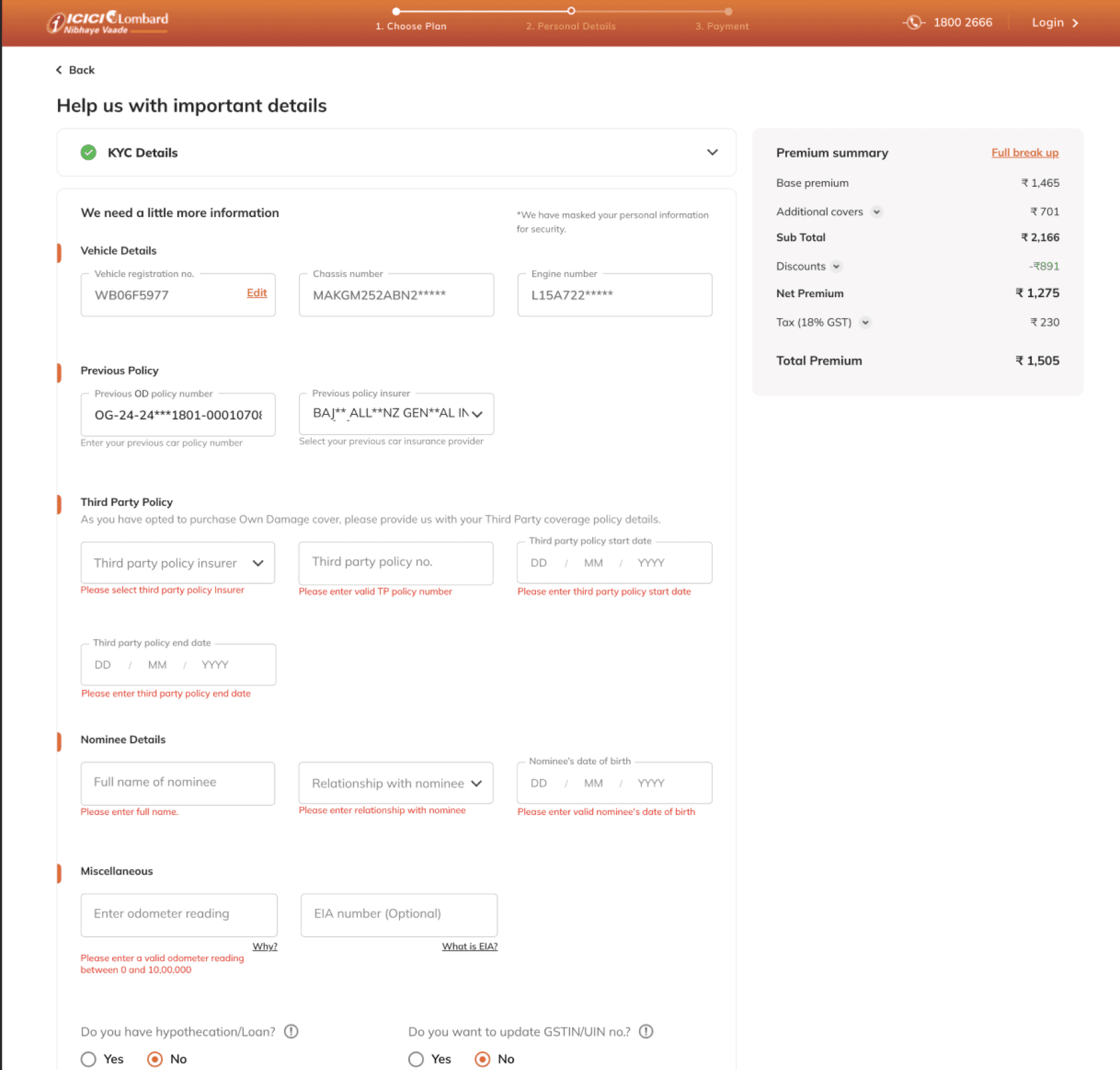
ICICI Lombard
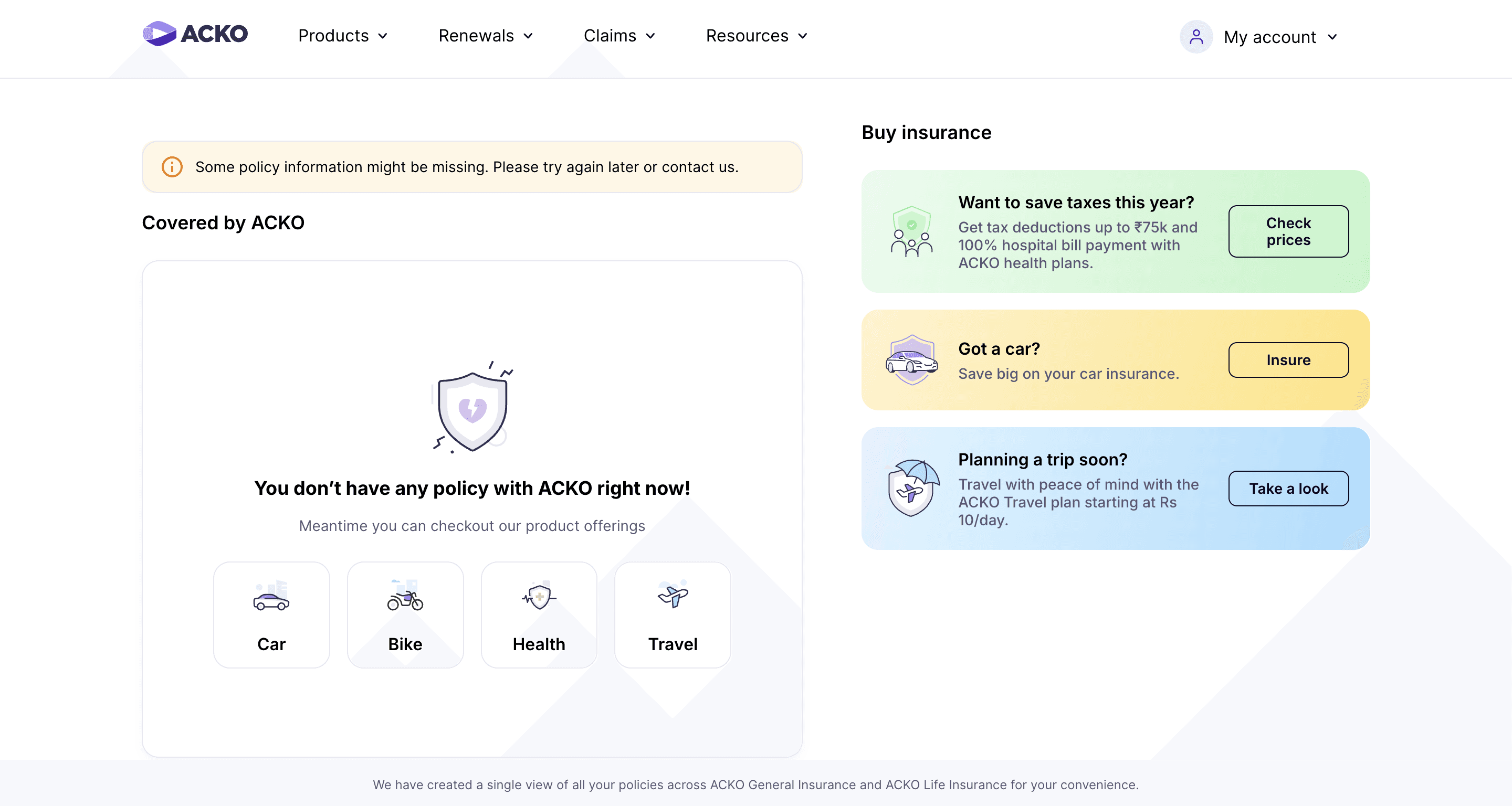
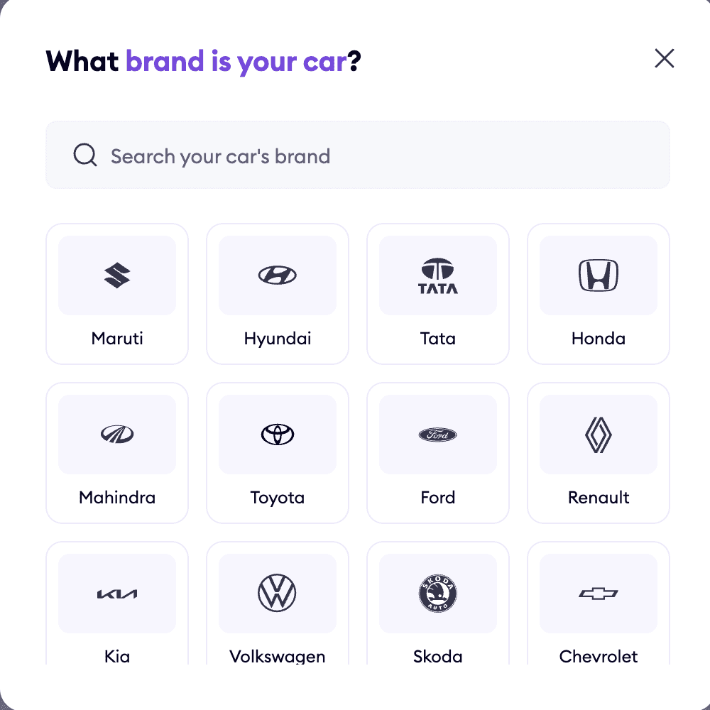
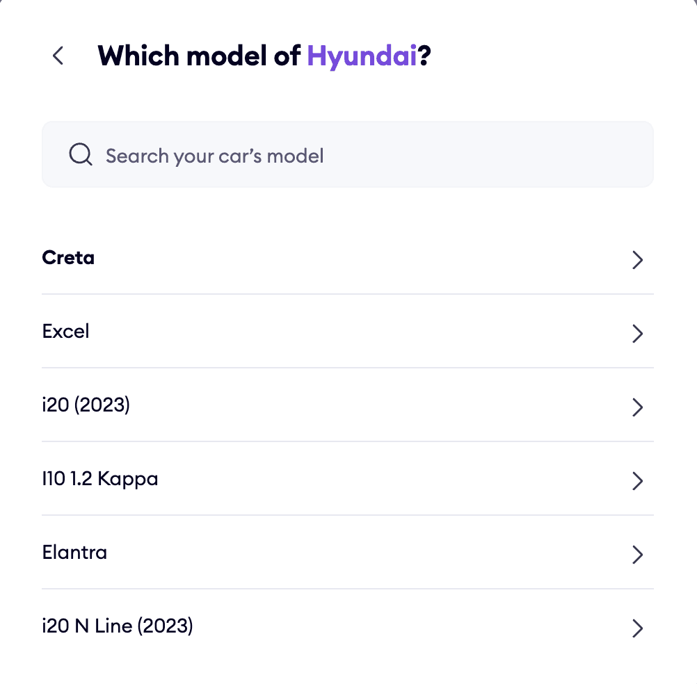
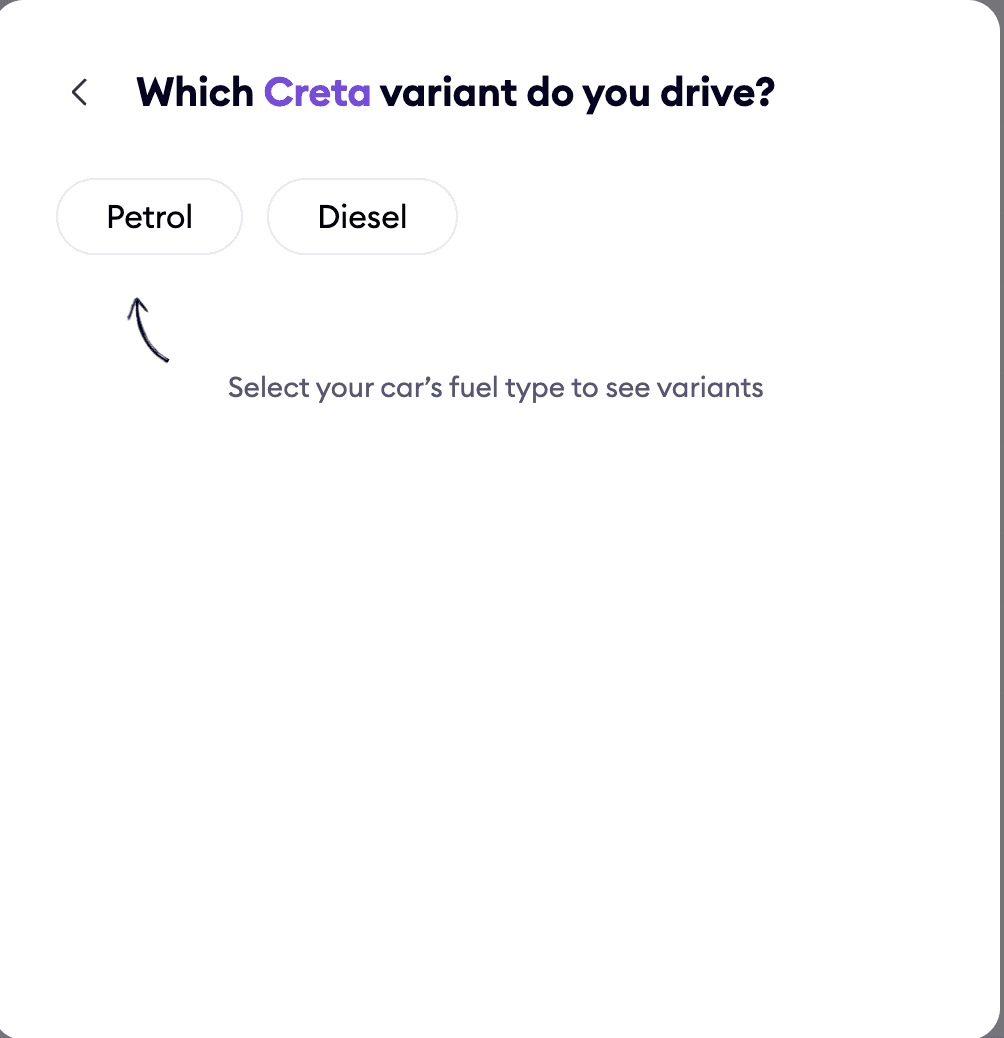
ACKO
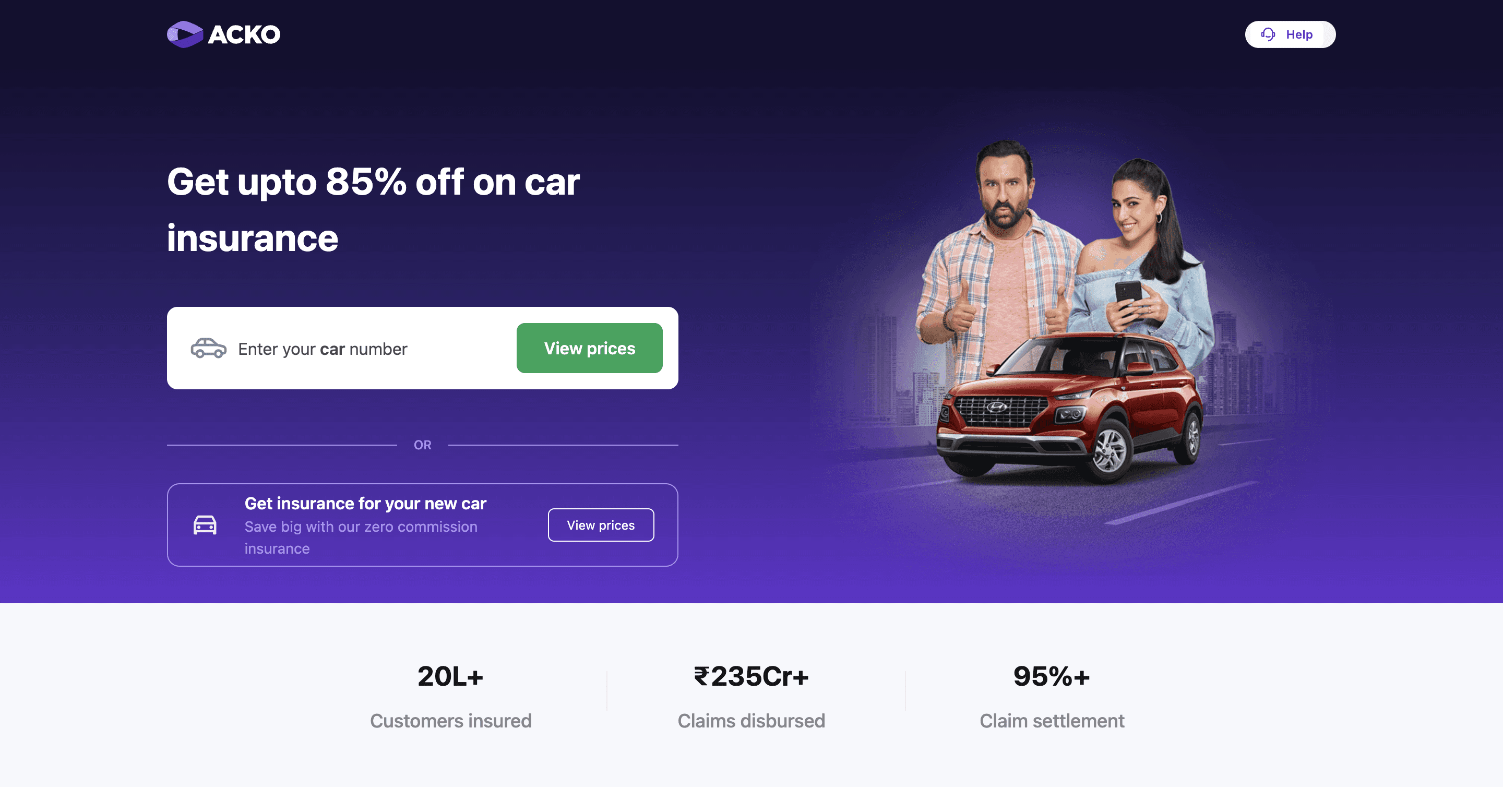
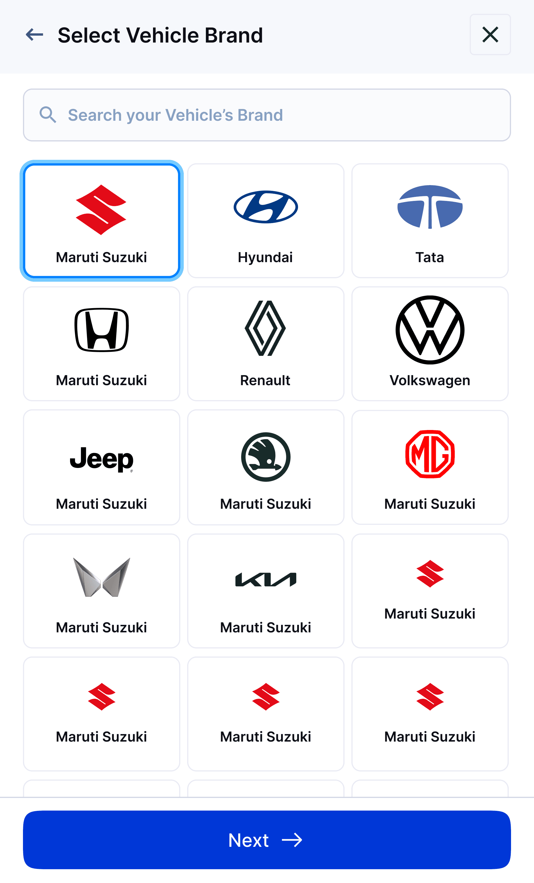
Clear insurance entry point from homepage -
The homepage clearly shows all insurance options like Car, Bike, and Health, so users can quickly choose what they need and begin.
Grid layout with brand icons for easy identification -
Logos and brand names are used to reduce effort and visually guide the user.
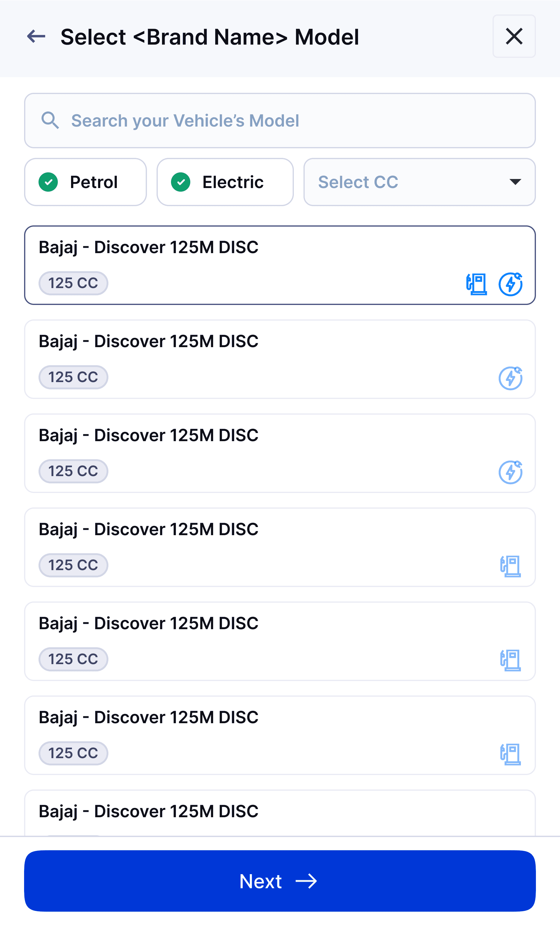
Segmented model list for clarity -
Models under the selected brand are presented in a clean list format, helping users quickly locate their car model without confusion.
Variant selection comes with
helpful categorisation -
Fuel type is selected first, followed by variant options—ensuring accurate configuration for insurance quotation.
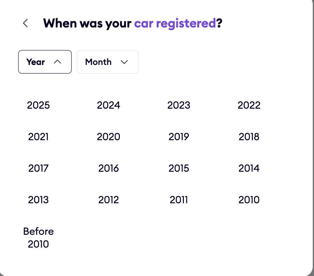
Quick year selection with calendar grouping -
A grid layout presents car registration years in a tappable format, avoiding manual date input and reducing form fatigue.
Strong CTA with contextual trust indicators -
Car insurance is clearly visible on the page and easy to spot. The text box stands out and adds some variety to the layout. It’s also easy for users to find the option to insure a new vehicle.
Insurance Dekho
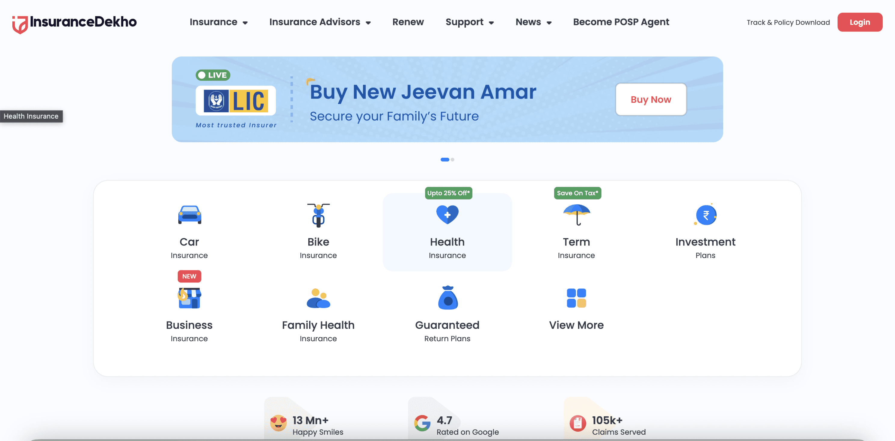
Categorised insurance offerings for easy navigation -
The homepage layout emphasises clear segregation of insurance types (Car, Bike, Health, etc.), enabling users to choose their category without friction.
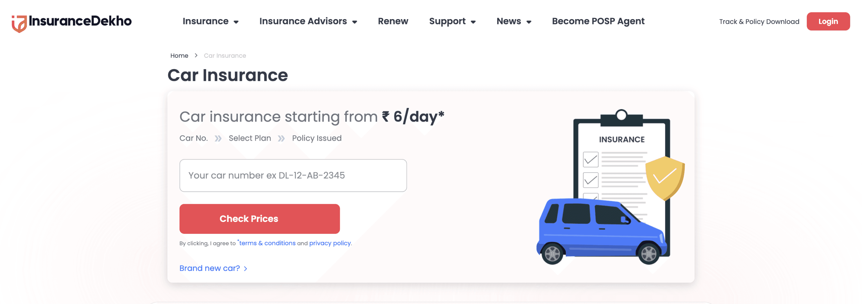
Straightforward form -
Users are asked to enter basic details like car number right at the start, keeping the process simple and easy to follow.
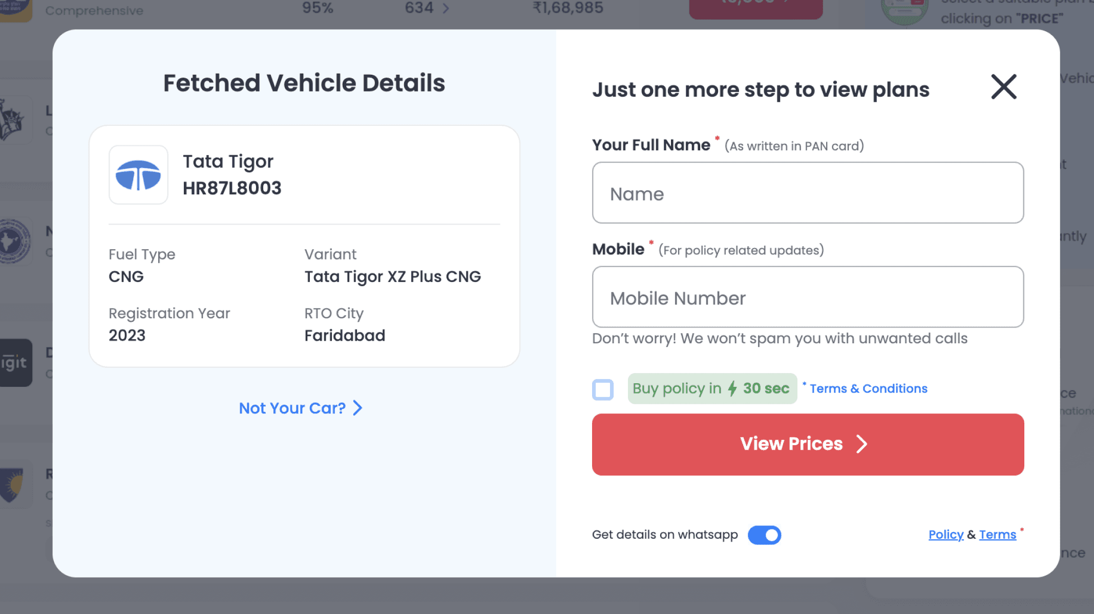
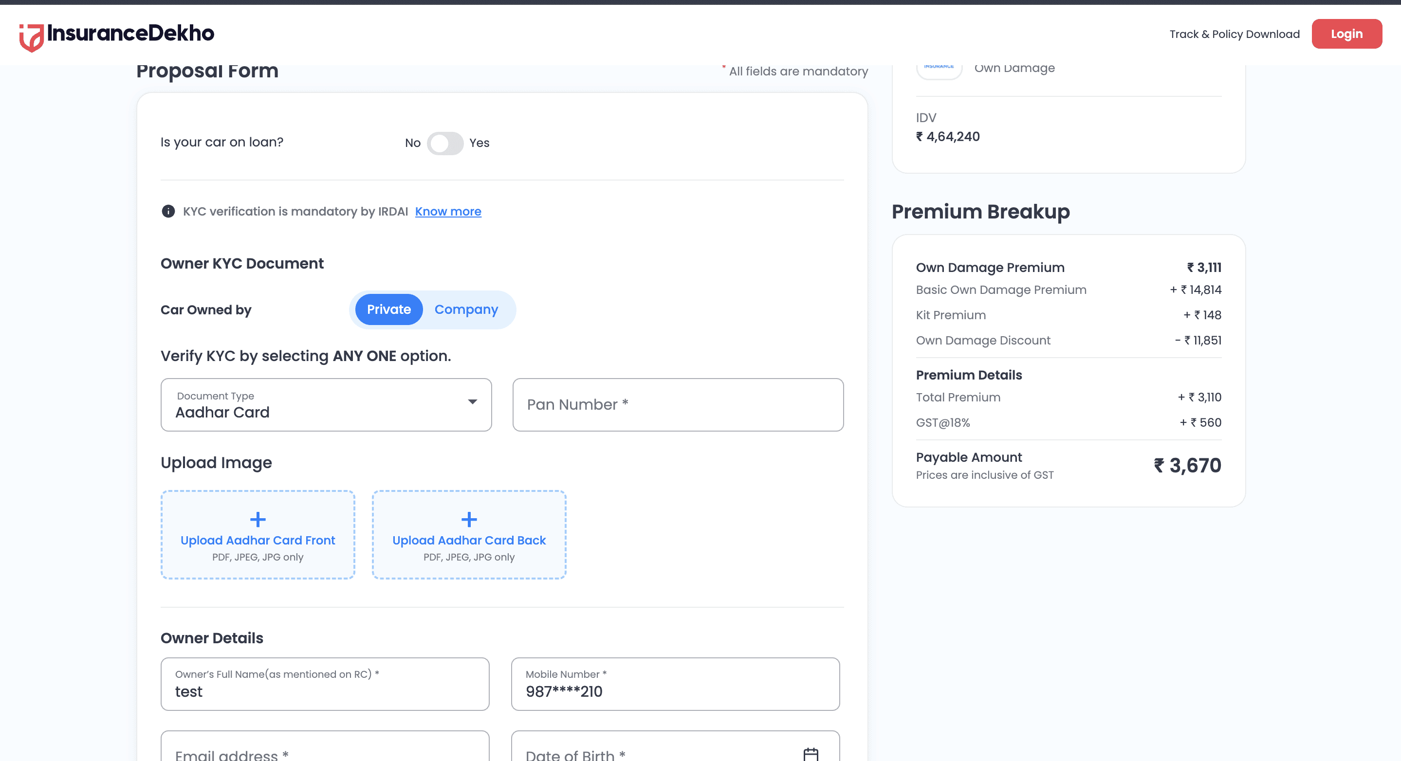
Information fetched and editable within modals -
Vehicle data is auto-fetched from registration input and editable inline, allowing users to verify or correct details without leaving the current flow.
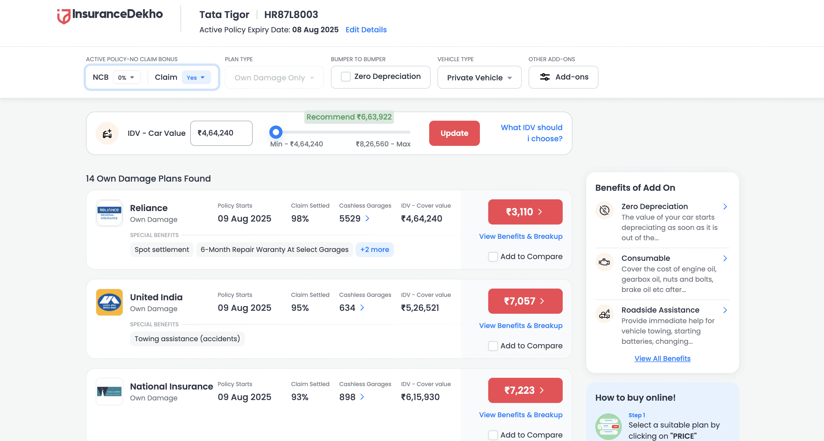
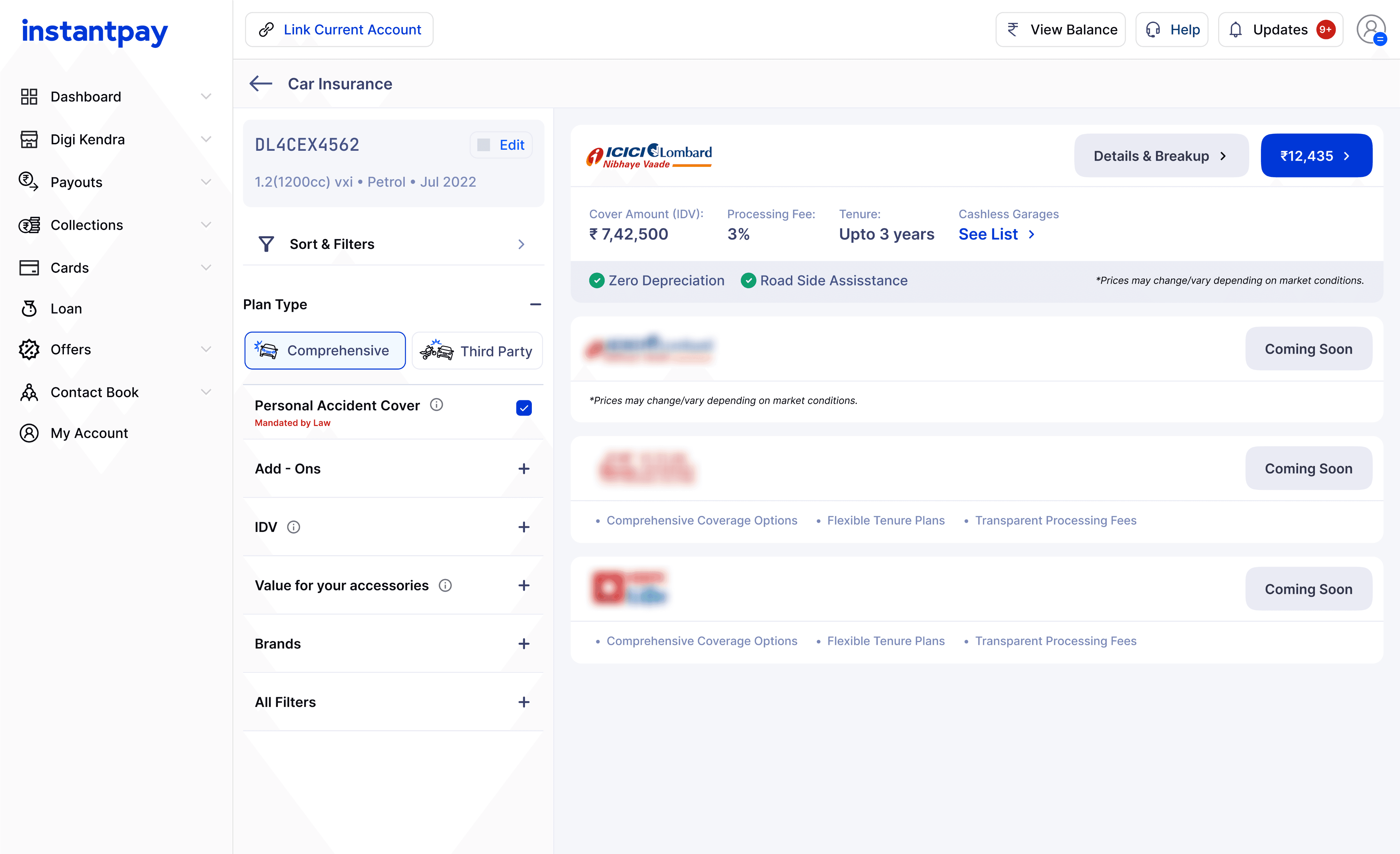
Comparison-first approach to build decision clarity -
Multiple insurers and plans are displayed side-by-side, with details like IDV, premiums, add-ons, and benefits clearly labeled for informed decision-making.
In-depth premium breakdown before payment -
It breaks down taxes, discounts, and net premium, reinforcing transparency and trust before users proceed with payment.
Digit insurance
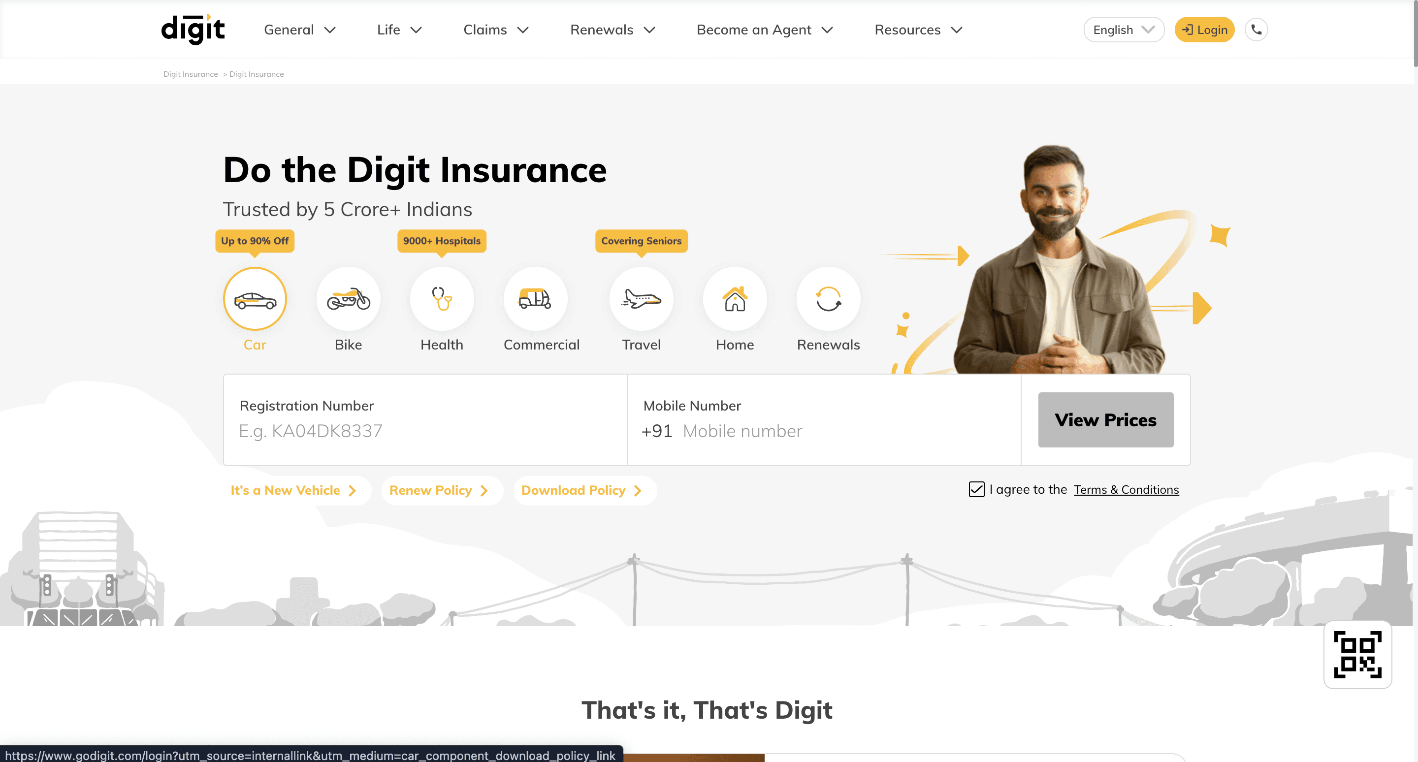
Quick entry with minimal distractions -
The homepage places core actions front keeping the layout clean and removing unnecessary elements to guide users directly into the quotation flow.
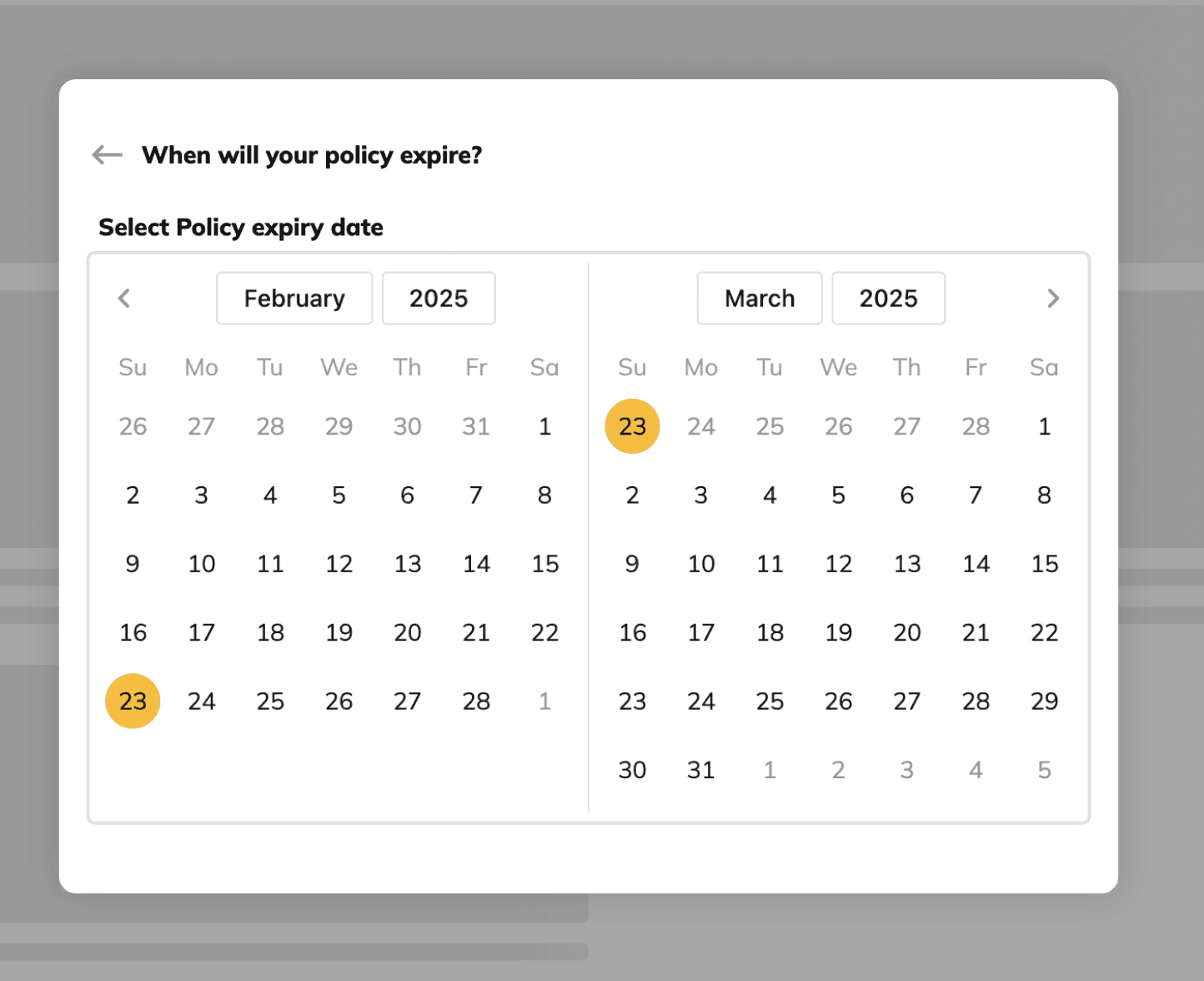
Intuitive date selection via calendar -
Instead of manual typing, Digit uses a large calendar selector, making expiry date input quick, visual, and error-free.
Offers clarity through modular pricing display -
Premium breakdown and discounts are split into interactive blocks—allowing users to toggle add-ons and immediately view price impact.
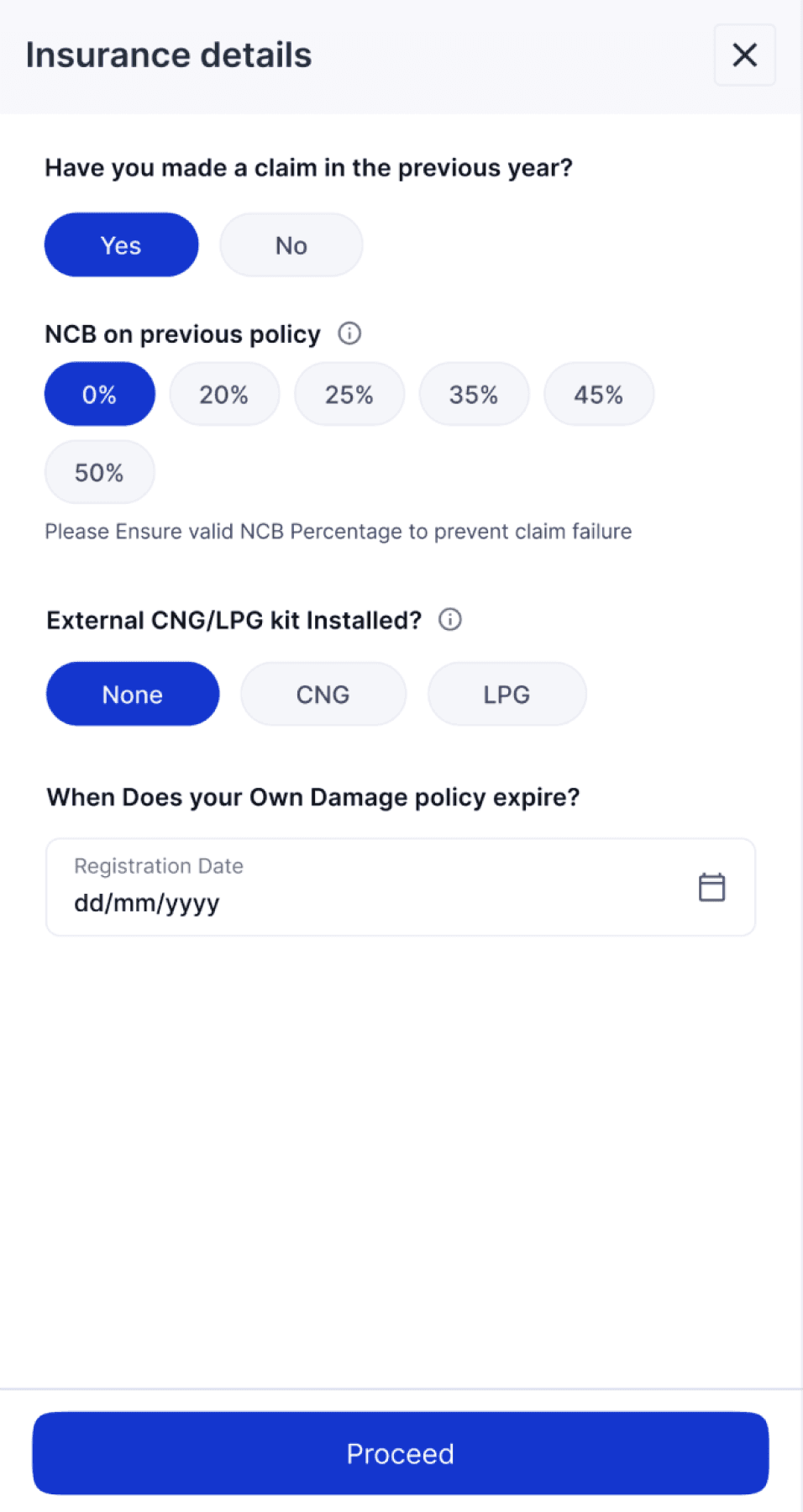
Helpful hints and highlighted warnings -
Text prompts and warning messages guide users on IDV selection, expired policies, and other critical form sections—minimizing errors before checkout.
PROBLEM STATEMENT
How might we enable users to buy insurance quickly and smoothly, without overwhelming them in the process?
MY APPROACH
To improve the experience, I focused on simplifying the journey—removing unnecessary steps and lengthy forms. Since the same user moved through multiple stages (learning, exam, selling) the flow had to feel natural and continuous. The goal was to make the process faster, require minimal input, and feel easy for retailers to complete.
USER Journey
POSP Onboarding
Insurance Trainee
Certification Exam
Certified Insurance Seller
SOLUTION
POSP Onboarding
01
When users land on the insurance page after logging in, a side drawer appears prompting them to complete the POSP exam before proceeding.
02
The user is asked to register by providing a few basic details.
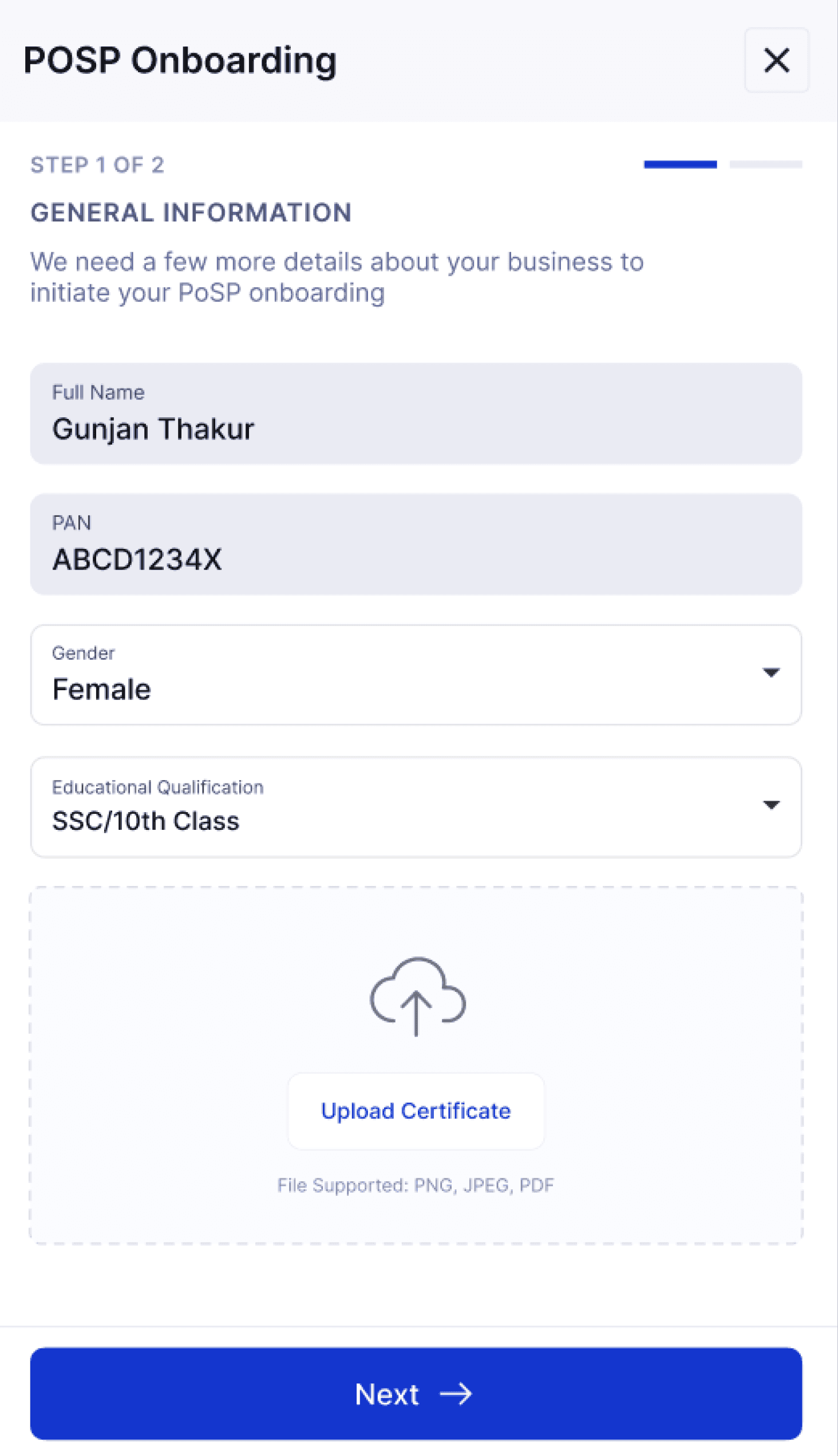
INSURANCE TRAINEE
03
The study material becomes accessible to the user.
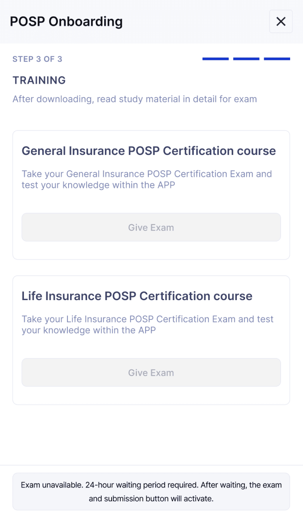
05
After the waiting period, the exam and submission buttons become active, allowing the trainee to proceed with the test.
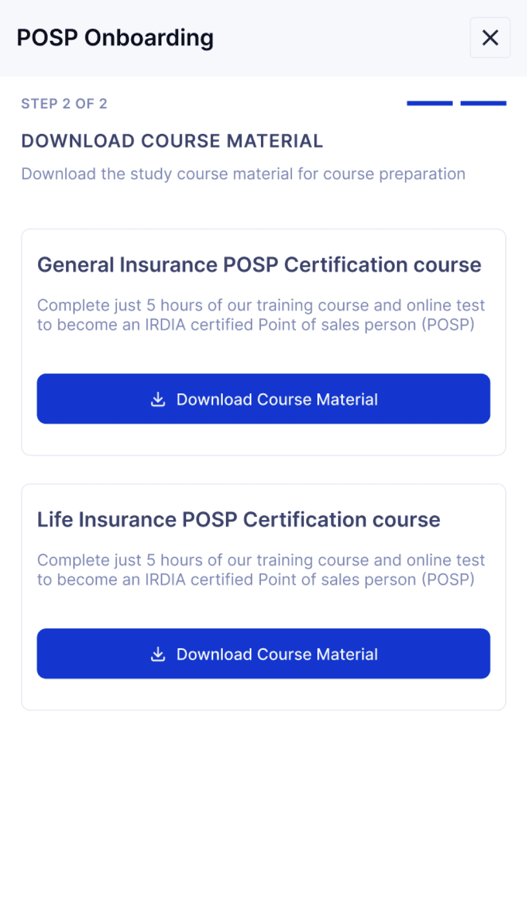
04
Once the study material is downloaded, a 24-hour waiting period begins.
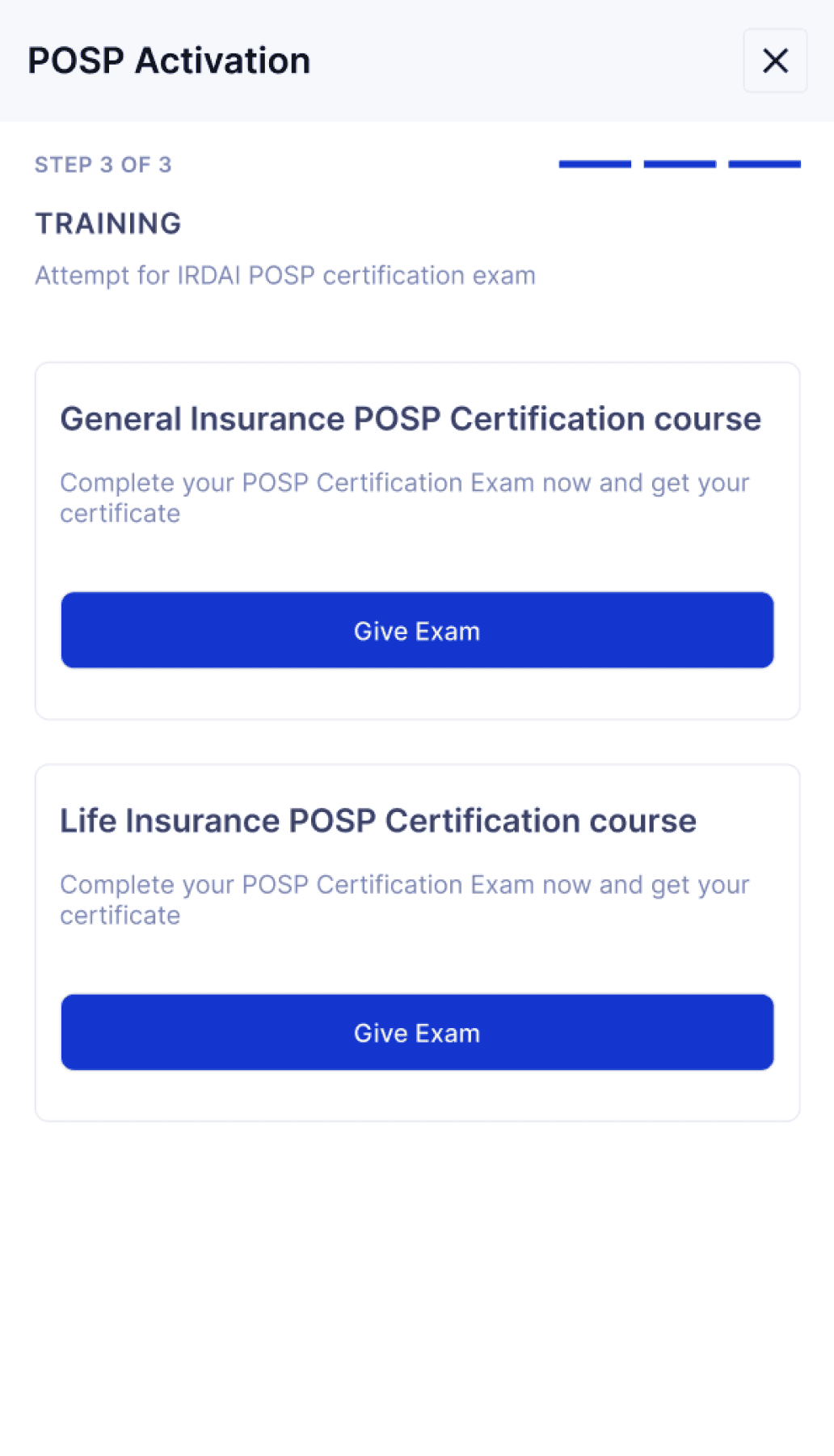
Certification Exam
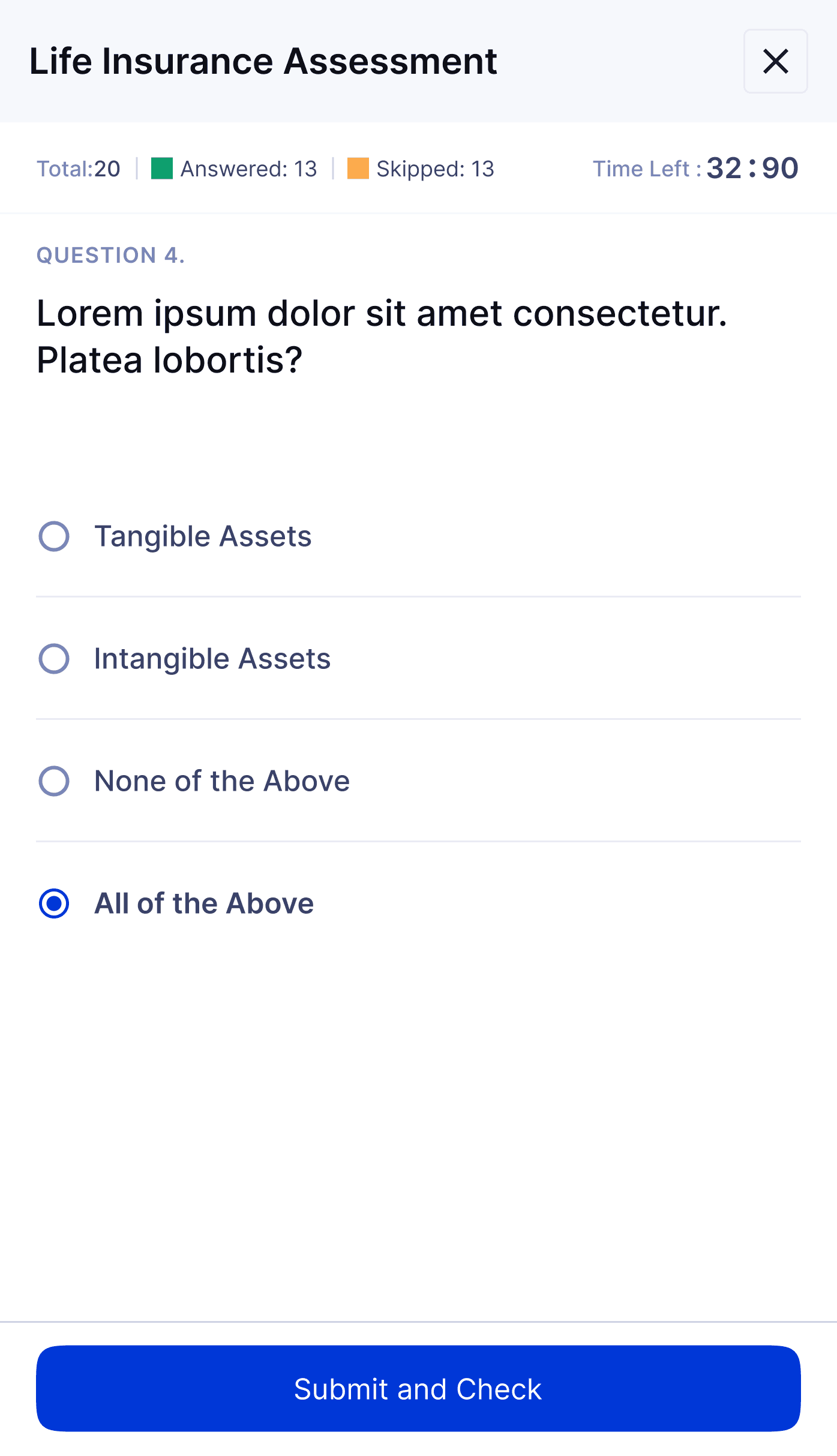
06
The certification exam is now available in a multiple-choice question (MCQ) format.
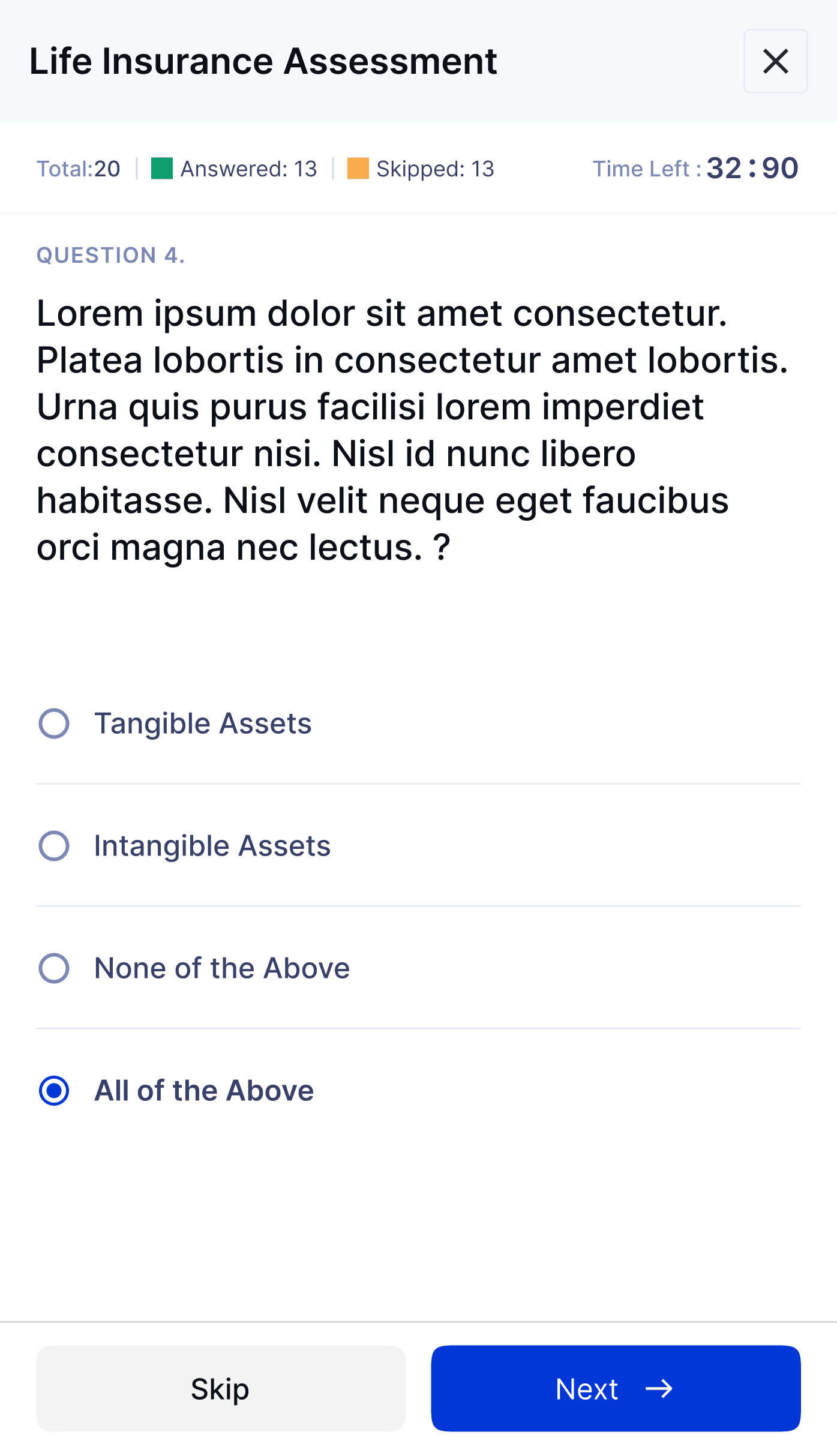
07
Once all questions are answered, the user can proceed to submit the exam.
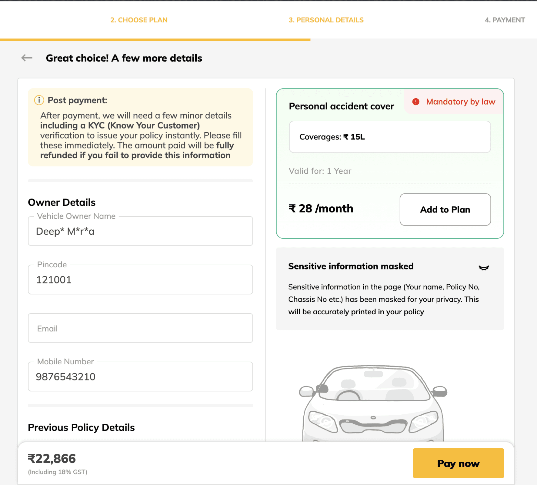
Certified Insurance Seller
Vehicle details
08
After passing the exam, the user is directed to the insurance dashboard.
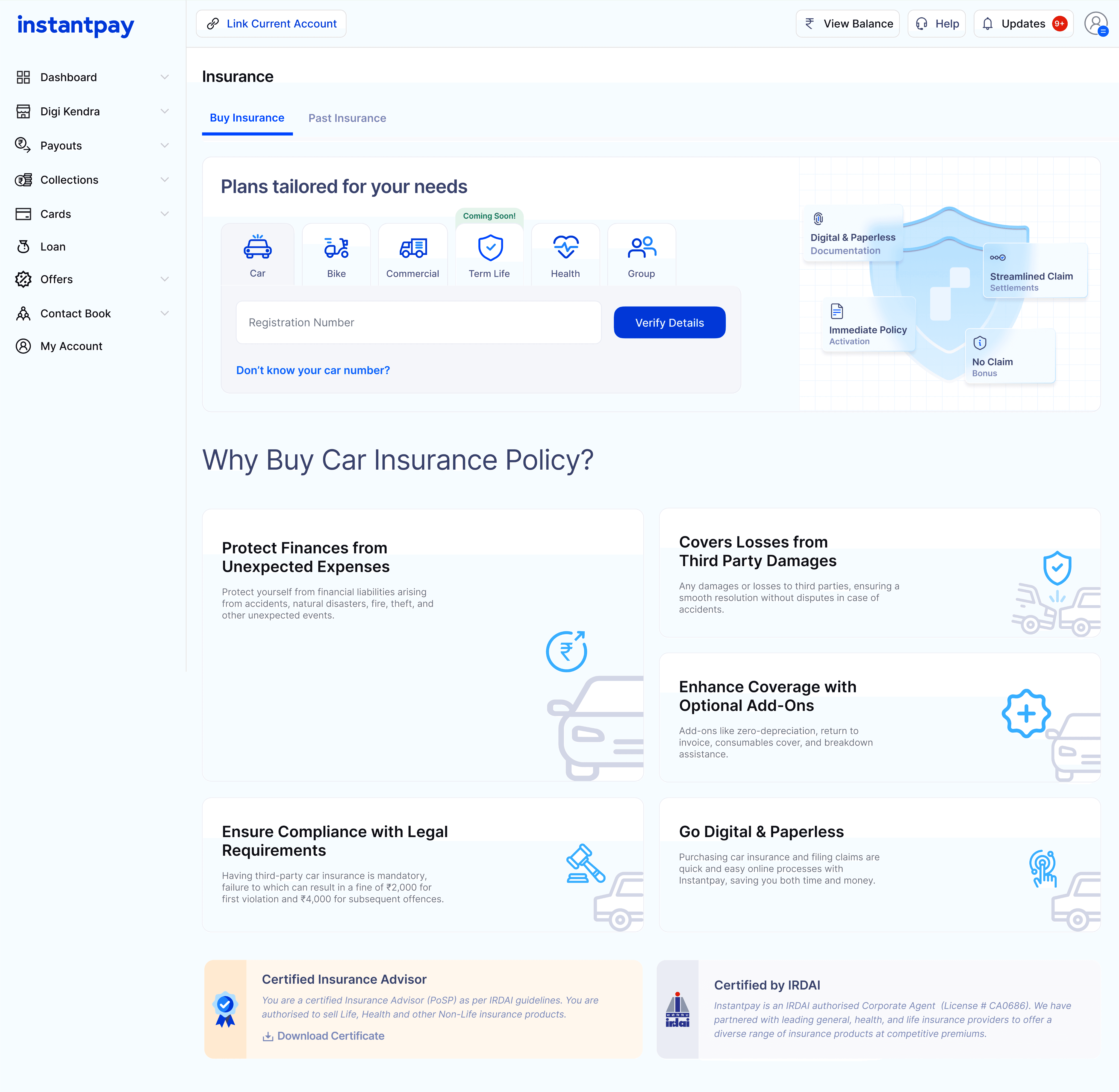
09
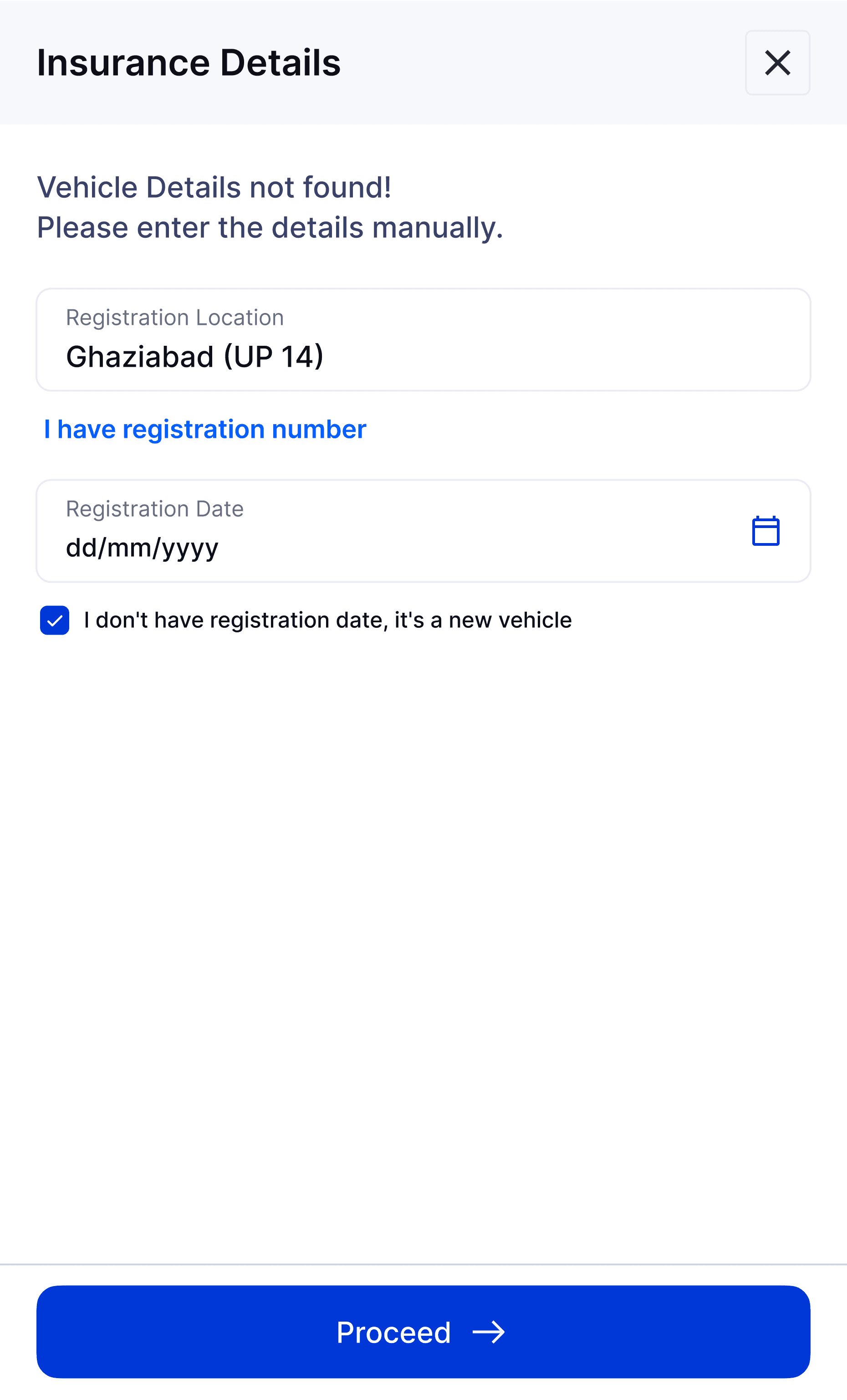
Once the vehicle number is entered, the user can continue filling in the remaining details.
10
After entering all the required details, personalized insurance plans will be displayed based on your needs.
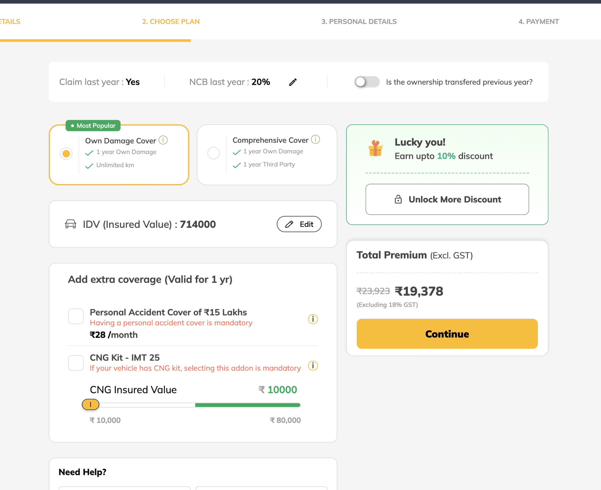
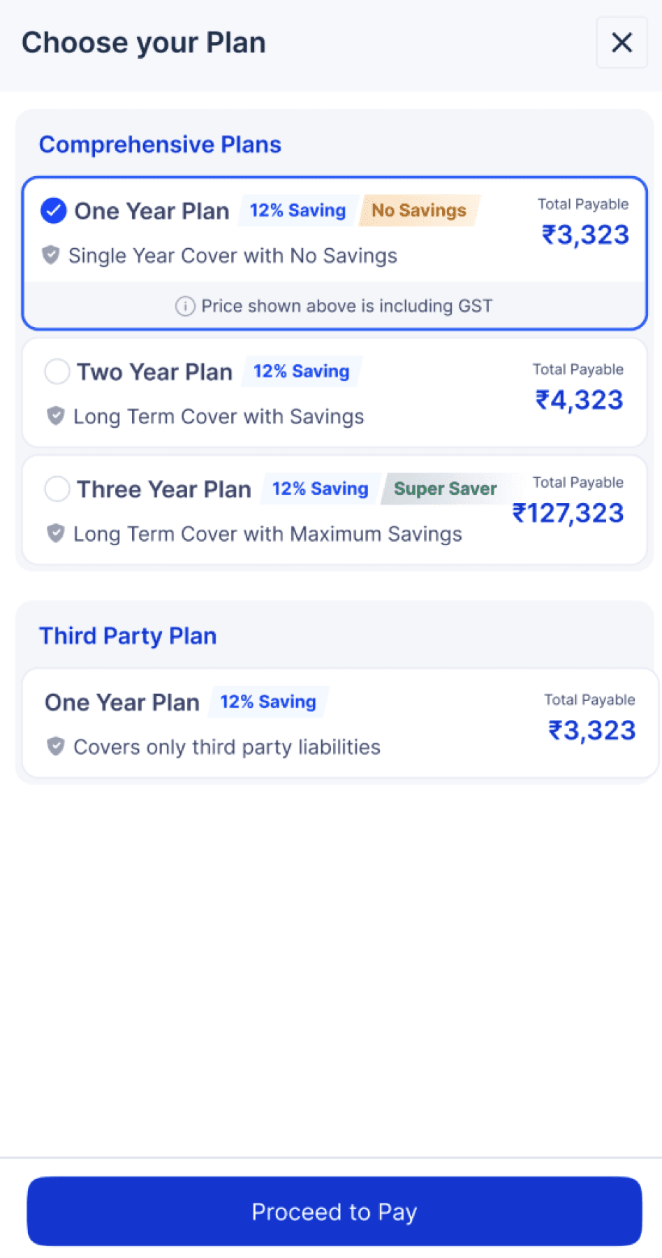
PLANS
Vehicle details
11
Provide the requested information and select a plan that suits you.
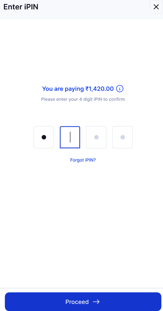
12
Once you've chosen a plan, enter your iPIN to proceed.
CHECKOUT
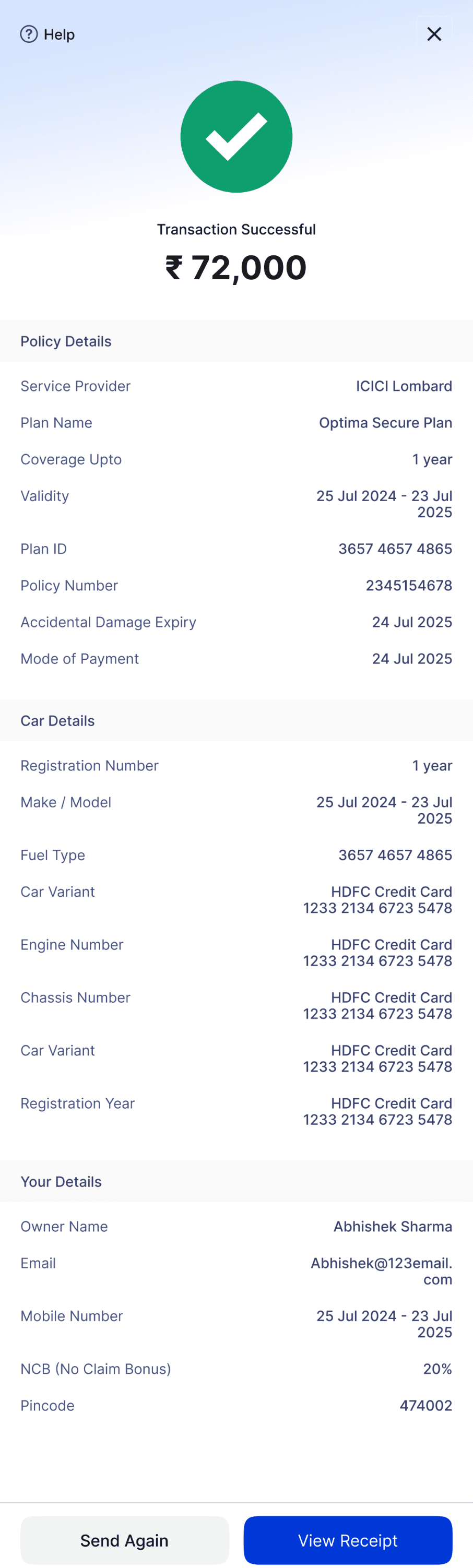
13
Your vehicle is now insured — all the details are available in the receipt.